WAYFAIR PROFESSIONAL / ENROLLMENT
A clearer way to join Wayfair Professional.
A clearer way to join Wayfair Professional.
A clearer way to join Wayfair Professional.
Turning a long, uncertain application into a guided enrollment experience.
Turning a long, uncertain application into a guided enrollment experience.

01 / OVERVIEW
The benefits were compelling. Getting there was harder.
The benefits were compelling. Getting there was harder.
The benefits were compelling. Getting there was harder.
Wayfair Professional gives business customers access to pricing and services for their purchasing needs. Joining is free, but applicants need to complete an application and verify their business.
Wayfair Professional gives business customers access to pricing and services for their purchasing needs. Joining is free, but applicants need to complete an application and verify their business.
I led the enrollment redesign, working with Product and Engineering to simplify the flow while accounting for new customers, existing accounts, and different verification methods.
I led the enrollment redesign, working with Product and Engineering to simplify the flow while accounting for new customers, existing accounts, and different verification methods.
MY ROLE
XD Lead / End-to-end interaction design
PARTNERS
Product, Engineering, Business, Analytics, Content Design
PLATFORM
WFUS web
The goal
The goal
Make it clear what to do, how far there is to go, and what happens next.
Make it clear what to do, how far there is to go, and what happens next.
The constraint
The constraint
Simplify the experience while retaining the information and verification the business needs.
Simplify the experience while retaining the information and verification the business needs.
OUTCOMES
Launched
March 2025 · WFUS web test
—
Outcome 01 · To be added
—
Outcome 02 · To be added
02 / PROBLEM
Too many steps. Too little certainty.
Too many steps. Too little certainty.
Too many steps. Too little certainty.
The original application spanned 5 to 8 steps. Benefits appeared on the first page, then disappeared. Without a clear progress indicator, customers could not tell how much was left.
The original application spanned 5 to 8 steps. Benefits appeared on the first page, then disappeared. Without a clear progress indicator, customers could not tell how much was left.
5–8 steps
5–8 steps
A lengthy application with limited visibility into progress.
A lengthy application with limited visibility into progress.
Less than 1%
Less than 1%
Of application starters completed business verification, according to the test-launch brief.
Of application starters completed business verification, according to the test-launch brief.
Swipe horizontally to inspect the screens
Swipe horizontally to inspect the screens

Original experience from the project deck. Funnel figures are documented in the March 2025 test-launch brief.
03 / RESEARCH
Map the states before simplifying the screens.
Map the states before simplifying the screens.
Map the states before simplifying the screens.
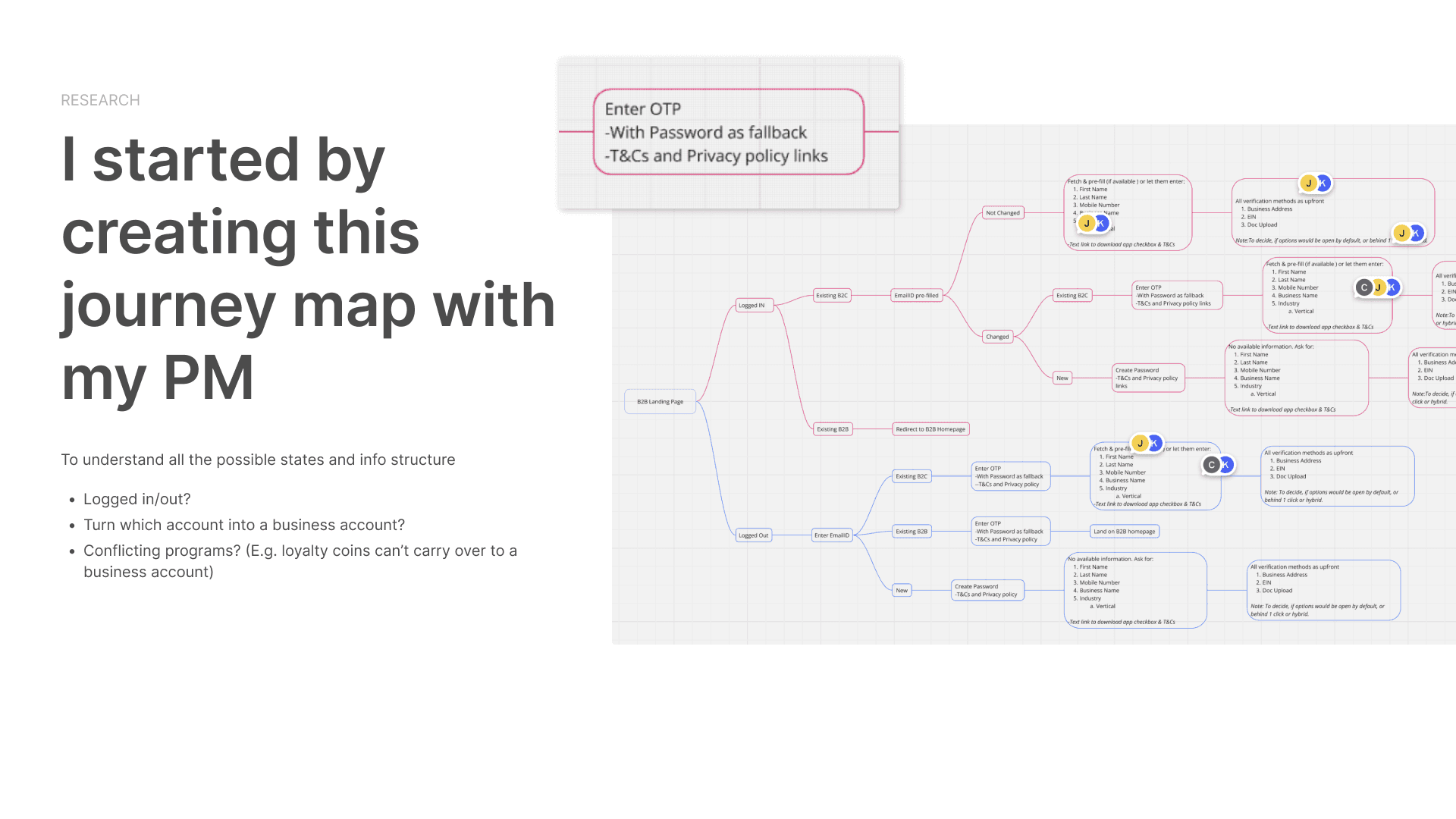
I mapped the journey with my PM: logged in or out, new or existing customers, personal-to-business account changes, and conflicting loyalty programs. This exposed the conditions the flow needed to handle.
I mapped the journey with my PM: logged in or out, new or existing customers, personal-to-business account changes, and conflicting loyalty programs. This exposed the conditions the flow needed to handle.
Swipe horizontally to inspect the screens
Industry audit
Industry audit
The research favored simpler flows: one page or up to three steps, with progress visible.
The research favored simpler flows: one page or up to three steps, with progress visible.
A shared definition of “simple”
A shared definition of “simple”
Fewer pages alone would not be enough. Customers also needed persistent context and a clear next action.
Fewer pages alone would not be enough. Customers also needed persistent context and a clear next action.
04 / APPROACH
Keep the context. Guide the next step.
Keep the context. Guide the next step.
Keep the context. Guide the next step.
Three visible stages
Three visible stages
Account setup, business information, and verification in a consistent page context.
Account setup, business information, and verification in a consistent page context.
Show only the relevant detail
Show only the relevant detail
Use progressive choices and tabbed verification methods to avoid sending customers through unnecessary screens.
Use progressive choices and tabbed verification methods to avoid sending customers through unnecessary screens.
The design focused on clarity at every stage: visible progress, persistent benefits, and explanations for consequential account changes.
The design focused on clarity at every stage: visible progress, persistent benefits, and explanations for consequential account changes.
05 / DESIGN — VERIFICATION
Three methods, one place to choose.
Three methods, one place to choose.
Three methods, one place to choose.
Address, EIN, and document upload became tabs within the verification step. Customers could understand the available routes without moving between separate pages.
Address, EIN, and document upload became tabs within the verification step. Customers could understand the available routes without moving between separate pages.
BEFORE / SEPARATE SCREENS
Swipe horizontally to inspect the screens

AFTER / TABBED METHODS
06 / DESIGN — BUSINESS INFORMATION
Fewer detours to describe a business.
Fewer detours to describe a business.
Fewer detours to describe a business.
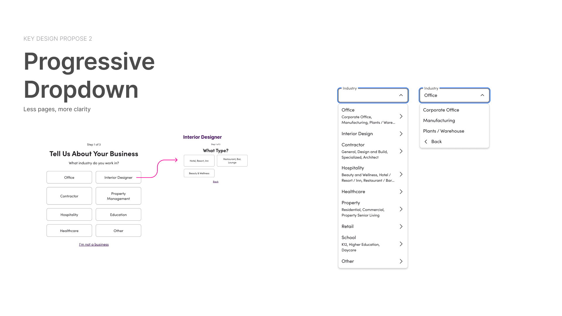
A progressive dropdown kept industry and business-type choices in the form. Selecting an industry revealed more specific options while retaining the current context.
A progressive dropdown kept industry and business-type choices in the form. Selecting an industry revealed more specific options while retaining the current context.
Swipe horizontally to inspect the screens
07 / TESTING & ITERATION
Clarity also means explaining the consequences.
Clarity also means explaining the consequences.
Clarity also means explaining the consequences.
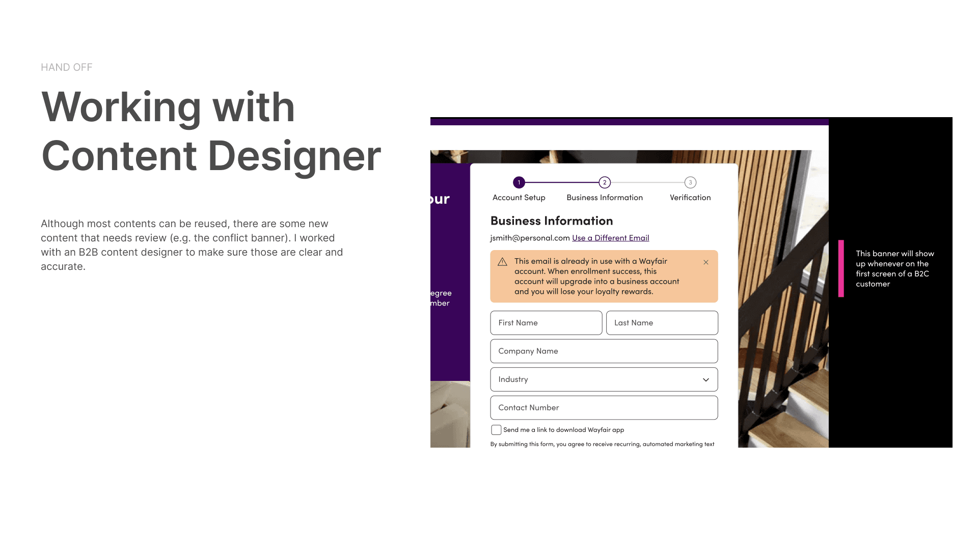
I shared an interactive prototype with Wayfair colleagues, designers, stakeholders, and my manager. Their feedback helped refine warning states and account-conversion language.
I shared an interactive prototype with Wayfair colleagues, designers, stakeholders, and my manager. Their feedback helped refine warning states and account-conversion language.
Tone matters
Tone matters
A red banner felt intimidating. The iteration used a calmer warning treatment where appropriate.
A red banner felt intimidating. The iteration used a calmer warning treatment where appropriate.
Be explicit about tradeoffs
Be explicit about tradeoffs
Existing customers wanted to know what would happen to loyalty rewards. I worked with Content Design to explain this before enrollment.
Existing customers wanted to know what would happen to loyalty rewards. I worked with Content Design to explain this before enrollment.
08 / ENGINEERING & HANDOFF
Make the behavior as clear as the screen.
Make the behavior as clear as the screen.
Make the behavior as clear as the screen.
I annotated responsive behavior and edge cases for Engineering. On mobile, the progress indicator remained accessible as customers moved through the form.
I annotated responsive behavior and edge cases for Engineering. On mobile, the progress indicator remained accessible as customers moved through the form.
Swipe horizontally to inspect the screens
Swipe horizontally to inspect the screens

Resume an application
Resume an application
The test included saved application state, allowing customers to return to previously entered information.
The test included saved application state, allowing customers to return to previously entered information.
Keep the release feasible
Keep the release feasible
The legacy lead-creation endpoint stayed behind a wrapper for the test. Its replacement was planned as a follow-up.
The legacy lead-creation endpoint stayed behind a wrapper for the test. Its replacement was planned as a follow-up.
09 / LAUNCH & EVIDENCE
A testable redesign, with a clear success measure.
A testable redesign, with a clear success measure.
A testable redesign, with a clear success measure.
The 50–50 A/B test began on March 4, 2025 for WFUS web customers. The launch brief defined a 3-day application-to-enrollment target of 24.9% to 27.4%, approximately a 10% relative increase.
The 50–50 A/B test began on March 4, 2025 for WFUS web customers. The launch brief defined a 3-day application-to-enrollment target of 24.9% to 27.4%, approximately a 10% relative increase.
7+ design iterations
7+ design iterations
Completed over 8 weeks, as documented in the portfolio deck.
Completed over 8 weeks, as documented in the portfolio deck.
$2.4M+ estimated sales impact
$2.4M+ estimated sales impact
Reported in the project deck as an estimate based on test data.
Reported in the project deck as an estimate based on test data.
The 10% relative lift is a launch target. Sales impact is an estimate reported in the project deck; the measurement window and attribution remain to be validated.
REFLECTION
Simplification is more than removing a step.
Simplification is more than removing a step.
Simplification is more than removing a step.
A shorter form still needs to earn trust. Mapping account states, showing progress, and explaining consequences made the experience clearer at the moments that mattered.
A shorter form still needs to earn trust. Mapping account states, showing progress, and explaining consequences made the experience clearer at the moments that mattered.
Back to selected work