

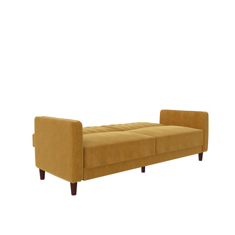
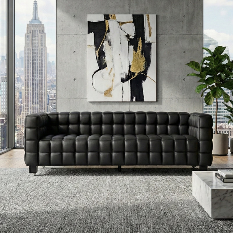
Faux Leather Square Arms Sofa
By Latitude Run®
$1,499.99$3,100.00
WAYFAIR BROWSE REDESIGN
Product Discovery
/
E-commerce
/
Design Systems

OVERVIEW
Wayfair was replatforming its storefront from a legacy monolith to React. This technical rebuild opened a window to rethink the whole storefront experience.
Having been on the Wayfair Design Systems team and worked closely with Storefront, I was asked to take on the role of Design Lead for the Browse experience, shaping its overall design direction with Product and Engineering.
MY ROLE
Design Lead + Design System
CORE PARTNERS
4 Product Managers · 10+ Engineers
Catalog Management · Head of Storefront
Search · PDP · Checkout
SECONDARY PARTNERS
Branding · Localization · Legal
Design System Engineers
PLATFORM
DWeb · MWeb · iOS · Android
OUTCOMES
Increased filter interaction by 14% through the redesigned browse experience.
Improved product click-through rate by 25.9% through the end-to-end browse redesign.
New-Platform
Catalog Coverage
Expanded new-platform coverage from zero to approximately 78% of the catalog.
Projected improvement from the proposed AI-powered browse experience.
Delivered within Homebase, Wayfair’s shared design system, during my time on the Design Systems team.
US, Canada, UK, Germany, and Ireland. Plus AllModern, Birch Lane, Joss & Main, and Perigold.
2024 company footprint, including Germany.
FY2025 vs. FY2024 · USD
(Reflects collective efforts across Wayfair, beyond this redesign)
Before & After
Drag to compare before and after.
OPPORTUNITY
Wayfair is a home furnishings e-commerce platform offering “One Zillion Things Home.” With so many choices, finding the right piece can feel like finding a needle in a haystack. Storefront’s goal was to help customers find the right fit through a clearer, more intuitive browse experience.

We looked back at the existing storefront to understand what worked and where customers struggled, using those lessons to guide the redesign.
Our goal was to make discovery feel easier—helping customers browse, compare, and find the right piece with greater confidence.
We wanted to prepare for AI and meet evolving shopper expectations as we laid the groundwork.
We also wanted a flexible storefront that would be easier to test, scale, and evolve—so the team could explore new ideas and build on what works.
We already had some rough ideas.
Research helped bring the teams together, decide what to prioritize, and raise early concerns.
01 / Stakeholders
I paired FullStory insights with PM conversations to understand what worked, what did not, and what to prioritize. Talking with Catalog Management revealed subtle differences between SKUs that the design needed to accommodate.

02 / Industry
I reviewed how other retailers approached discovery to see what the industry was doing, challenge our early ideas, and uncover possibilities worth exploring. The audit included Amazon (+Prime Day), Home Depot, Canadian Tire, Taobao, Dick’s Sporting Goods, Etsy, and eBay.








03 / Support Team
Having been on that team, I already had the knowledge and working relationships to get hands-on. Thanks to that trust, I wore two hats on this project (both storefront redesign and component work) and advocated for its use on other pages in the funnel.

04 / Future Stakeholders
Wayfair operates 5 brands and 5 geos with shared page logic and engineering foundations. I met early with brand and geo stakeholders to discuss potential future requests and get an early heads-up to avoid confusion later.
 Germany
 UK
UK Ireland
 Canada
 US
USALIGNED APPROACH
01
Turn text-only information into visual cues so customers can see what makes a product relevant at a glance.
02
Give the most useful information visual priority, with a clear hierarchy that keeps secondary details from competing for attention.
03
Give customers a reason to explore further—from discovering a promising product to visiting its detail page and moving closer to a purchase.
REDESIGN / CARDS
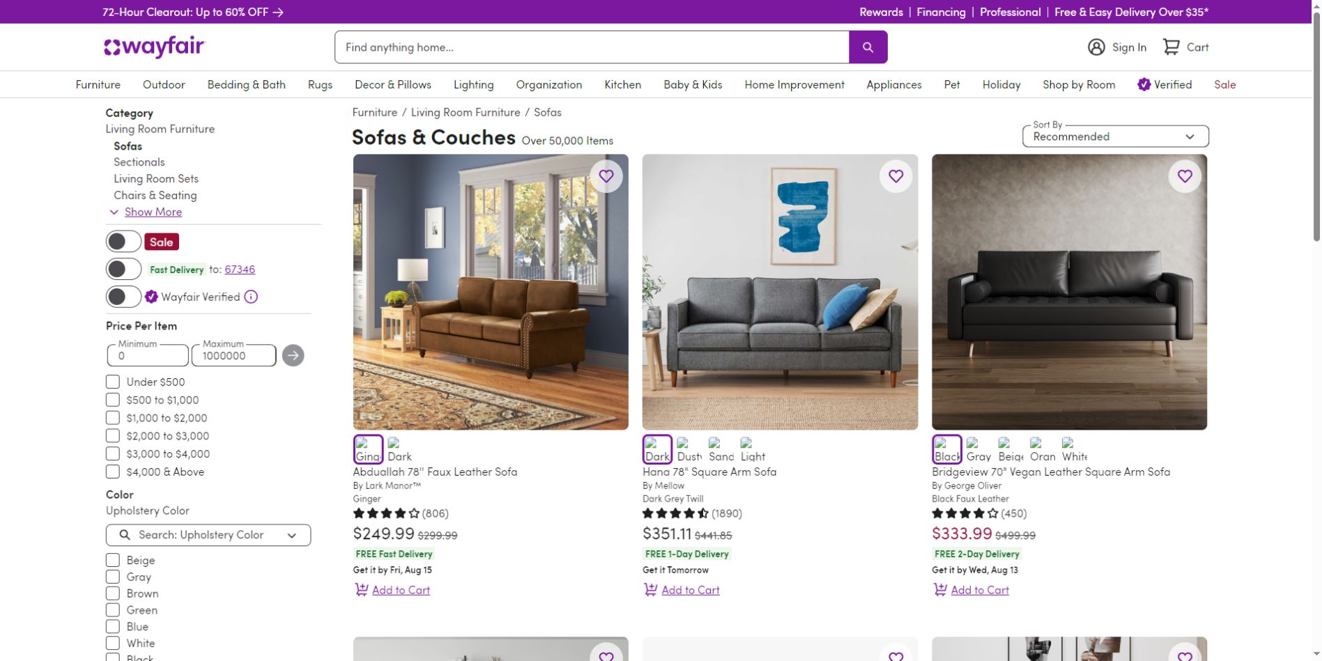
We aligned that four cards per row felt crowded, making valuable details in top results easy to miss.
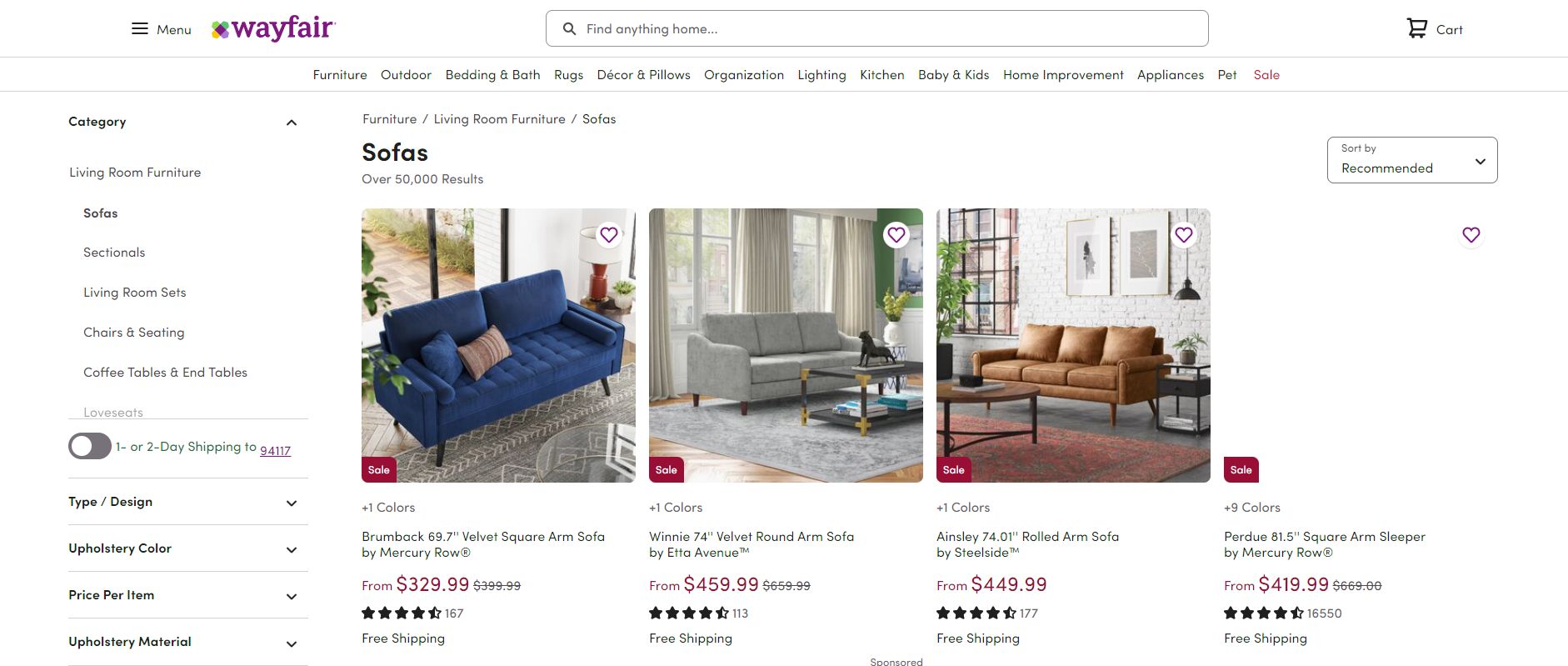
With React enabling interactive cards, we moved to three, giving each product more space and richer details to help customers explore, visit the PDP and move toward purchase.
Before · 4 cards per row
A crowded layout makes key details easy to miss.
After · 3 cards per row
More space. More product details.
WEB
At 1440px, accounting for filters, margins and gaps left a 1040px grid: three 336px cards, with 16px between them.
1440 − 48 (side margins) − 320 (filters) − 32 (gap) = 1040px
Based on the 1440px Figma example. Side margins are inferred from the remaining 48px; the most common screen size needs confirmation from historical traffic data.
On narrower screens, the grid uses two columns. Card widths adapt to the available space, with a consistent 16px gap between them.
Card width = (grid width − 16px) ÷ 2
The breakpoint refers to the grid container, not the screen width.
16px between cards
ABOUT THE CARD
With the card width established, we worked inward: padding, information hierarchy and space for interaction. React made individual elements interactive, giving customers more ways to explore within each card.
Hover anywhere. The whole card responds.
Try the options, heart, image, and quick view.
01 / OPTIONS
Show the choice, not just the count.
Next, we balanced how many options to show with the space available inside the narrowest card. Visual thumbnails let customers preview a color or finish without leaving the grid.
Recognize it
See the available finishes instead of interpreting “More options.”
Compare it
Switch the product image without opening several product pages.
Keep exploring
Stay in the grid while deciding which product deserves a closer look.
Why six thumbnails?
Balance choice and space. We chose up to six visible thumbnails to accommodate common option sets without crowding the card, with additional choices available through overflow.
Design for the narrowest card. Card padding, six thumbnails, the gaps and any overflow control had to fit together. The goal was to preserve selectable targets of at least 24 × 24 CSS px, rather than shrink them to fit.
Options first. Video later.
Browse supports quick discovery and comparison. For the MVP, we prioritized option previews and left richer video exploration to the PDP, keeping engineering scope manageable.
02 / DELIVERY BADGE
The Pushback
Make delivery visible. Keep the product first.
The Delivery team proposed three badge designs and preferred 02 or 03 to emphasize Free Delivery. As the card designer, I pushed back to protect the information hierarchy.
03 / Attention without meaning
I challenged the rainbow first. It grabbed attention, but the colors communicated no additional delivery benefit.
02 / Too much emphasis
The bold treatment made delivery the first thing to notice. Customers should evaluate the product first; delivery should support that decision.
We aligned on 01: a restrained green badge that kept delivery recognizable, carried forward the pre-replatform color, and preserved the balance of the whole card.
03 / CARD SIZE
Fewer cards. More room to display.
Moving from four cards to three per row gave interactive controls and useful product details more space. The goal was a more meaningful first scan, rather than fitting in the most products.
BEFORE / 4 CARDS
AFTER / 3 CARDS
Layout schematic: the same row accommodates fewer, richer cards.
06 / REDESIGNING THE FILTERS
I replaced hidden or text-heavy choices with visual cues and directly interactive controls.

Before: text-only choices. After: visual swatches with a clear selected state.
Text → visual thumbnails
Use color, material, or style imagery when a picture explains the difference faster than a label.
Accordion → direct interaction
Expose useful controls so customers can act without repeatedly opening and closing filter groups.

Project exploration: price, ratings, color, and category controls.
BADGE BRANDING
Different benefits. One visual language.
I brought Sale, Fast Delivery, and Wayfair Verified into a more consistent treatment so each cue could be recognized without competing for attention.

Category navigation and high-priority shopping shortcuts.
07 / PRODUCT SPECS & COMPARISON
Prioritize three
Choose the three most valuable attributes for the category.
Handle missing data
When an attribute is unavailable, show the next most useful one.
Keep comparison aligned
Carry the same vocabulary into the table so differences are easy to scan.

Inline specs: comfort level, mattress type, and thickness support product evaluation.

Compare Similar Items: align relevant attributes across products.
08 / LOCALIZATION
The Browse system needed room for the information customers expect in each market.
Canada
Support local shopping context, including Made in Canada and postal-code-based experiences.
United Kingdom
Make room for market-specific information such as energy labels on applicable product cards.

Project examples for Canada and the United Kingdom.
09 / BRANDING & THEMING
Homebase provided shared patterns while letting brand expression change across the storefront.
Consistent behavior
Keep familiar interactions across cards, filters, and comparison.
Flexible expression
Allow typography, color, and visual tone to reflect the brand.
Reusable patterns
Work with shared components so changes can scale across the experience.

Project exploration: shared Browse patterns with a different brand treatment.
Thanks for exploring the work.